WATCH: Modern Meets Traditional, A Client Story
It all started with the idea to upgrade kitchen cabinetry. Often when we hear this, we see clients start to question if this will make them enjoy their space more, or start to dislike other areas that are now exposed as ‘aging’ or dated’. Will this become a full renovation? Should we think about any structural changes that require drawings and blueprints? Will the scope of the project expand to include other rooms in the home? Or maybe it will all come together with a few other cosmetic changes and interior upgrades?
Setting the scene. The home in question is over half a century old, situated in a beautiful mature neighborhood close to the river in Saskatoon. While it may not be the clients’ forever home, it has been their home for 10 years and they have no plans to move.
Brandon Gay using his keen eye to carefully define every element for the project presentation
Step 1
When you want a new kitchen- you start shopping! The clients visited three local cabinet companies before realizing that just replacing the cabinets could and likely would lead to some potential incongruencies with other elements of the home, like millwork, closet doors, and even paint.
Step 2
Self-check. Ask yourself, will you be able to bring all these elements together in a cohesive, functional manner that will work now and in years to come? Do you WANT the responsibility? And do you have the time?
Step 3
Answer the above honestly. Then contact the design professionals!
This is where our story begins…
We always want the client to feel heard and be engaged in the process. So, we begin by educating the client. They usually know what they like and don’t like in their homes, that’s why they come to us after all. But interior design is more than not liking your color scheme or wanting a bigger kitchen. It’s the ability to have an overall vision for a cohesive look or “style story” throughout your home. Just as a company has a brand identity, your home should have a ‘house identity’. We can help you create that in a non-obvious manner.
Now back to this specific project.
After a visit to see the client’s home, our goal was to develop three options for a new floor plan in our conceptual phase. Because the kitchen was the main area of concern for this young family, and because it is often the most used space in a home, our focus is there first.
We start by presenting the three uniquely curated concepts we’ve developed. Then we carefully discuss the options together which allows the client to make an educated decision that they can feel confident about.
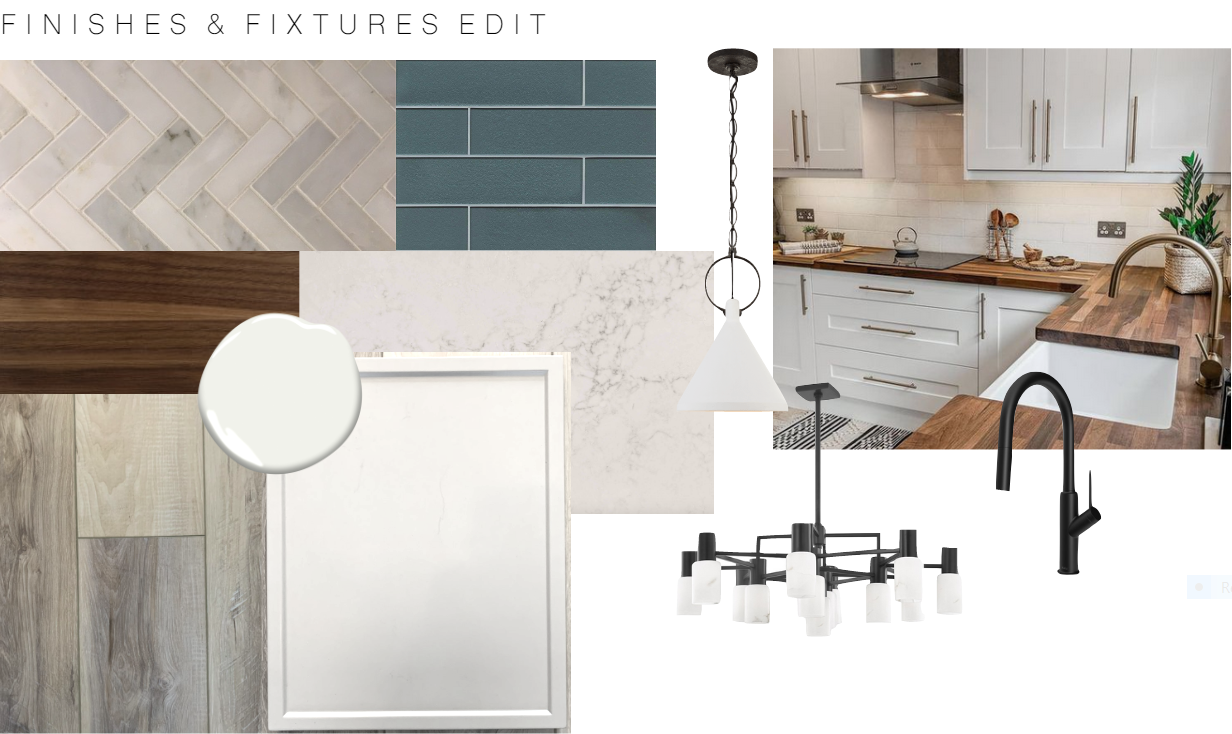
A gallery overview of the mood board and inspiration images created to give the client direction and visuals on the color scheme, materials and overall ‘feeling’ for the project
And The Winner Is…
The client landed on their favorite option, which makes the overall working and traffic area larger and more functional. We included:
a floor to ceiling pantry
an oversized 9 foot butcher block island, with a hearty walnut feel
a light oak style vinyl flooring with a grey tone for durability and beauty
a natural and warm color scheme using man-made materials
a quartz countertop with a light marbling for a little depth (achieving a soft and timeless look)
two options for the backsplash: a Calcutta marble in a herring bone pattern OR we can get adventurous with the blue glass 2x8 subway tile from Alyse Edwards for more impact
black hardware to elevate the classic elements and to provide contrast
Calcutta marble or an icy blue glass backsplash? Both will be beautiful backdrops in this pristine white kitchen with a warm walnut countertop and bold black fixtures.
By blending traditional designs with modern features and materials you can achieve the best of both worlds. In this instance, the flat panel door with the subtle detail around the edge of the frame creates a sophisticated elegance against the beautiful white kitchen.
Now back to the issue we spoke about at the beginning. What are the tie-ins? What elements can we introduce in the other areas of the home to compliment the new kitchen to bring the space together as a whole, which is what brought them to us originally.
Got the Blues?
We landed on integrating highlights of blue throughout which allows for an interesting soft mixture of modern meets traditional.
Shades of blue were selected to tie all the new elements into the old aesthetics for a sophisticated style throughout.


